Analyzing hysteresis loops using the General T-Q SOM#
This tutorial will demonstrate a basic workflow for analyzing suspended sediment transport hysteresis loops using the pre-trained General T-Q SOM. For details on how this SOM was trained, check out our research paper.
The workflow will be illustrated using a time series of discharge and turbidity for which a set of hydrologic events where previously delineated.
Beyond HySOM (and its dependencies: numpy, matplotlib and numba), Pandas is required to run this notebook, so make sure you have it installed.
from hysom.utils.datasets import get_01191000_qt_data, get_01191000_events_data
from hysom.utils.plots import heat_map, heatmap_frequency
from hysom.pretrainedSOM import get_generalTQSOM
from dataclasses import dataclass, field
import matplotlib.pyplot as plt
from datetime import datetime
import numpy.typing as npt
from typing import Any
import pandas as pd
import numpy as np
Load data#
First, let’s load a sample dataset included in the HySOM package. The dataset contains two main pices of data:
qt: Pandas dataframe with time series data of discharge and turbidityevent_times: list of (start,end) times for each event
qt = pd.DataFrame(get_01191000_qt_data())
qt.set_index("datetime", inplace=True, drop=True)
event_times = get_01191000_events_data()

print(f"{len(event_times)} events. First 5:")
print(*event_times[:5], sep= "\n")
print("\nTime Series:")
qt.head()
253 events. First 5:
(datetime.datetime(2016, 6, 4, 8, 8, 46, tzinfo=datetime.timezone.utc), datetime.datetime(2016, 6, 9, 6, 2, 42, tzinfo=datetime.timezone.utc))
(datetime.datetime(2016, 6, 9, 19, 8, 42, tzinfo=datetime.timezone.utc), datetime.datetime(2016, 6, 14, 17, 2, 39, tzinfo=datetime.timezone.utc))
(datetime.datetime(2016, 6, 29, 8, 33, 29, tzinfo=datetime.timezone.utc), datetime.datetime(2016, 7, 4, 6, 27, 25, tzinfo=datetime.timezone.utc))
(datetime.datetime(2016, 7, 6, 15, 57, 4, tzinfo=datetime.timezone.utc), datetime.datetime(2016, 7, 9, 9, 27, 2, tzinfo=datetime.timezone.utc))
(datetime.datetime(2016, 7, 9, 11, 16, 12, tzinfo=datetime.timezone.utc), datetime.datetime(2016, 7, 11, 20, 34, 55, tzinfo=datetime.timezone.utc))

Time Series:
| Qcms | turb | |
|---|---|---|
| datetime | ||
| 2016-05-31 21:15:00+00:00 | 0.387941 | 2.4 |
| 2016-05-31 21:30:00+00:00 | 0.387941 | 2.5 |
| 2016-05-31 21:45:00+00:00 | 0.370951 | 2.3 |
| 2016-05-31 22:00:00+00:00 | 0.370951 | 2.3 |
| 2016-05-31 22:15:00+00:00 | 0.370951 | 2.3 |
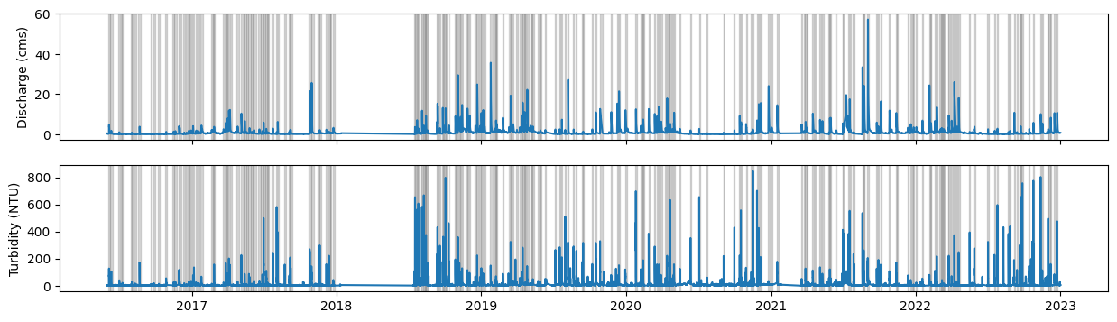
Plot data:#
fig, (axq, axt) = plt.subplots(2,1, sharex = True, figsize = (15,4))

axq.plot(qt["Qcms"])
axq.set_ylabel("Discharge (cms)")
axt.plot(qt["turb"])
axt.set_ylabel("Turbidity (NTU)")

for start, end in event_times:
    for ax in [axq, axt]:
        ax.axvspan(xmin = start, xmax = end, alpha = 0.3, color = "grey")
Preprocess data#
Let’s prepare the data to make it compatible with HSOM. For a detailed explanation of the preprocessing steps check out this tutorial
To facilitate the analysis, I’ll first define a helper function to interpolate C-Q data (loop_interpolation) and a data structure to easily store and access event information including starting and end dates, the corresponding hysteresis loop and additional attributes (Event):
def loop_interpolation(CQtimeSeries: pd.DataFrame, seq_length) -> np.ndarray:
    """
    Interpolates a hysteresis loop in the C-Q plane to make it compatible with `HSOM`.
    The resulting loop will have `seq_length` evenly spaced data points.
    Note that the interpolation procedure ignores time information

    Parameters:
    - CQtimeSeries (pd.DataFrame): Pandas DataFrame with two columns. Typically: (discharge, concentration)
    - seq-length (int): number

    Returns:
    - np.ndarray: Numpy array of shape seq_length x 2 with the interpolated sequence

    """
    col1, col2 = CQtimeSeries.columns
    accum_dists = (
        (CQtimeSeries[col1] - CQtimeSeries.shift(1)[col1])**2 + (CQtimeSeries[col2] - CQtimeSeries.shift(1)[col2])**2
        ).apply(np.sqrt).cumsum()
    accum_dists.iloc[0] = 0.0
    path_length = accum_dists.max()

    interp_dists = np.linspace(0,path_length, seq_length)

    col1_interp = np.interp(interp_dists, accum_dists, CQtimeSeries[col1])
    col2_interp = np.interp(interp_dists, accum_dists, CQtimeSeries[col2])

    return np.stack((col1_interp, col2_interp), axis = 1)

@dataclass
class Event:
    start: datetime
    end: datetime
    loop: npt.ArrayLike = field(repr=False)
    attributes: dict[str, Any] = field(default_factory=dict, repr=False)

    def get_attribute(self, key: str, default: Any = None):
        return self.attributes.get(key, default)

    def set_attribute(self, key: str, val: Any):
        self.attributes[key] = val
Extract loops and some atrributes (maximum discharge and turbidity) for each event and store them in a list:
loops_and_metrics = []
events = []
for start, end in event_times:
    qtevent = qt[start:end]
    qtnormalized = (qtevent - qtevent.min()) / (qtevent.max() - qtevent.min())
    loop = loop_interpolation(qtnormalized, 100)
    qmax = qtevent["Qcms"].max()
    turbmax = qtevent["turb"].max()
    events.append(Event(start = start, end = end, loop=loop, attributes={"qmax":qmax, "turbmax":turbmax}))
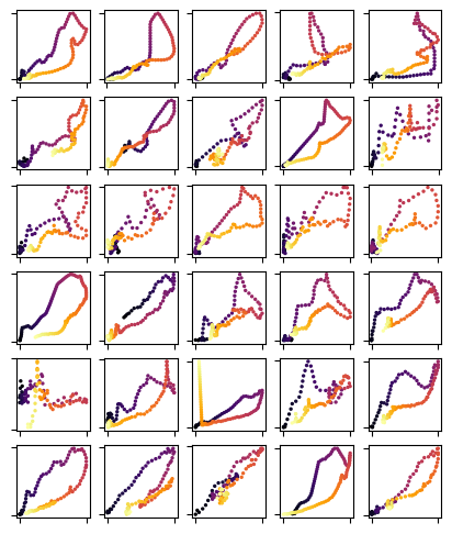
Let’s visualize some loops
fig, axs = plt.subplots(6,5, figsize = (5,6))

for event, ax in zip(events[:30], axs.flatten()):
    loop = event.loop
    ax.scatter(loop[:,0], loop[:,1], cmap = "inferno", c = range(len(loop)), s = 2)
    ax.tick_params(labelbottom = False, labelleft = False)
Analyze the data with the General T-Q SOM#
Let’s load the General T-Q SOM first#
TQsom = get_generalTQSOM()
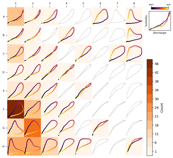
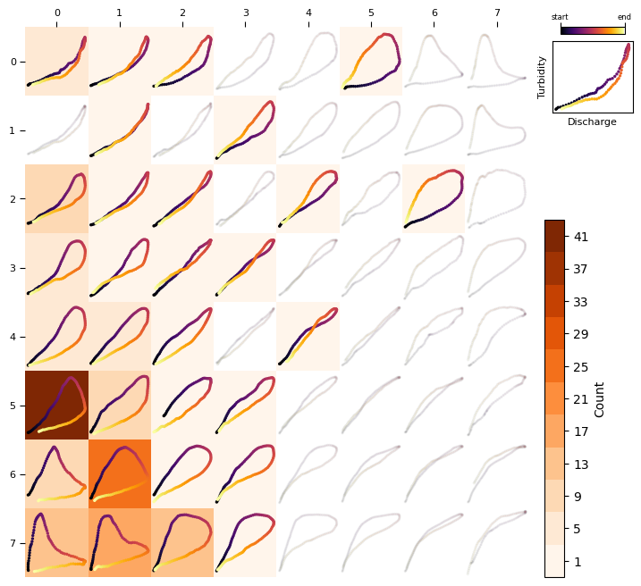
Plot the frequency distribution including all loops:
heatmap_frequency(TQsom, [ev.loop for ev in events])
Now, let’s add a couple more attributes to each event: the bmu and the distance_to_bmu as measured by the distance function (in this case: DTW, See more details in our research paper and SI)
for ev in events:
    ev.set_attribute("bmu",TQsom.get_BMU(ev.loop))
    ev.set_attribute("distance_to_bmu",TQsom.get_distance_to_bmu(ev.loop))
See below the frequency distribution of distance_to_bmu values. Note that this distance measures the similarity between a loop and its associated BMU, with larger distances indicating less similarity. Loops that are too different from their BMU should be filter out to reduce noise and misleading results.
_ = plt.hist([ev.get_attribute("distance_to_bmu") for ev in events])
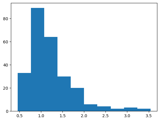
Let’s use a threshold of 1.5 as an acceptable value (this is a rough estimate. In a real analysis you want to find a value that works for you)
filtered_events = list(filter(lambda x: x.get_attribute("distance_to_bmu") < 1.5, events))

print(f"{len(filtered_events)} valid events")
197 valid events
See below the frequency distribution with the filtered data:
heatmap_frequency(TQsom, [ev.loop for ev in filtered_events], coordinates_style="matrix")
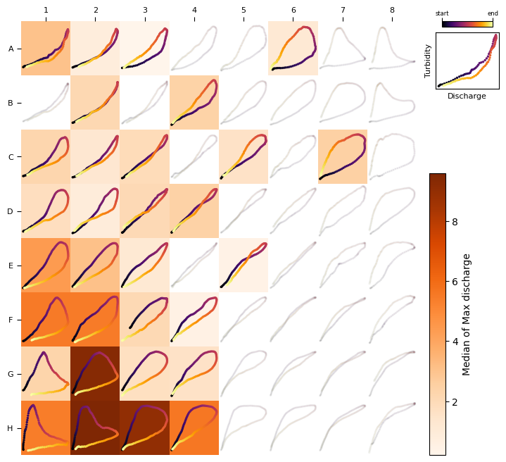
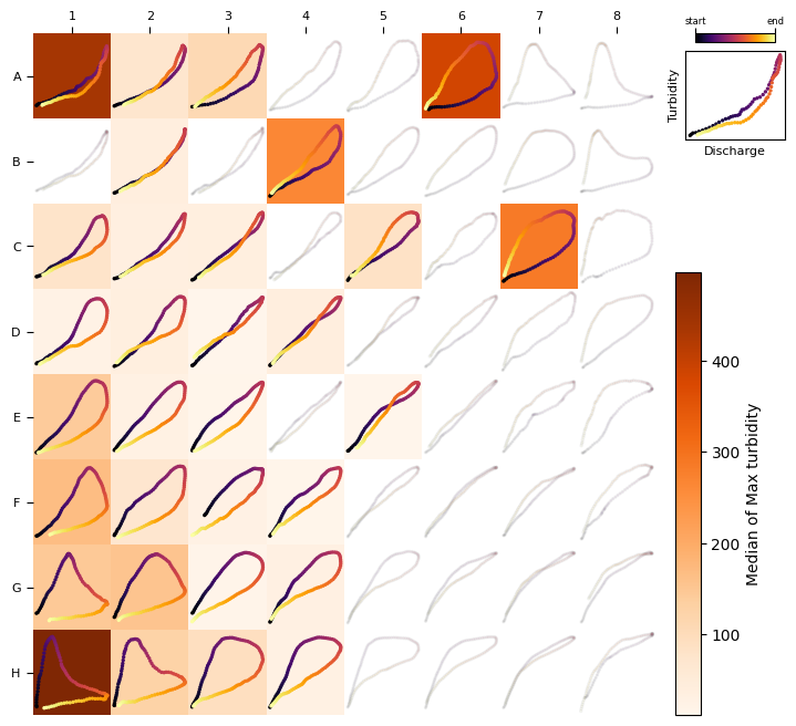
Let’s plot now a heat map to visualize the association between loop types and discharge and tubidity:
loops,qmax,turbmax = zip(*[(ev.loop, ev.get_attribute("qmax"), ev.get_attribute("turbmax")) for ev in filtered_events ])
heat_map(TQsom, loops, qmax, colorbar_label="Median of Max discharge", agg_method=np.median)
heat_map(TQsom, loops, turbmax, colorbar_label="Median of Max turbidity", agg_method=np.median)
You can also extract the frequency matrix and attribute matrices shown in the heatmaps:
TQsom.frequency_matrix([ev.loop for ev in filtered_events])
array([[ 6.,  1.,  1.,  0.,  0.,  1.,  0.,  0.],
       [ 0.,  1.,  0.,  1.,  0.,  0.,  0.,  0.],
       [11.,  2.,  1.,  0.,  1.,  0.,  1.,  0.],
       [ 5.,  2.,  1.,  1.,  0.,  0.,  0.,  0.],
       [ 6.,  6.,  2.,  0.,  1.,  0.,  0.,  0.],
       [41., 12.,  2.,  1.,  0.,  0.,  0.,  0.],
       [ 9., 26.,  2.,  3.,  0.,  0.,  0.,  0.],
       [15., 19., 15.,  1.,  0.,  0.,  0.,  0.]])
TQsom.attribute_matrix([ev.loop for ev in filtered_events], [ev.get_attribute("qmax") for ev in filtered_events]).round(2) # round to 2 decimals for visualization only
array([[3.04, 0.81, 0.21,  nan,  nan, 1.13,  nan,  nan],
       [ nan, 2.15,  nan, 2.41,  nan,  nan,  nan,  nan],
       [2.23, 1.27, 1.93,  nan, 1.6 ,  nan, 2.52,  nan],
       [1.79, 0.93, 2.05, 2.45,  nan,  nan,  nan,  nan],
       [4.4 , 3.09, 1.17,  nan, 0.43,  nan,  nan,  nan],
       [5.52, 5.47, 2.1 , 0.5 ,  nan,  nan,  nan,  nan],
       [2.33, 9.37, 1.72, 1.6 ,  nan,  nan,  nan,  nan],
       [5.44, 9.6 , 9.03, 5.64,  nan,  nan,  nan,  nan]])
TQsom.attribute_matrix([ev.loop for ev in filtered_events], [ev.get_attribute("turbmax") for ev in filtered_events]).round(2) # round to 2 decimals for visualization only
array([[437.  ,  72.7 , 110.  ,    nan,    nan, 384.  ,    nan,    nan],
       [   nan,  38.8 ,    nan, 265.  ,    nan,    nan,    nan,    nan],
       [ 78.4 ,  34.7 ,  37.5 ,    nan,  83.6 ,    nan, 285.  ,    nan],
       [ 26.  ,  36.25,  11.4 ,  38.7 ,    nan,    nan,    nan,    nan],
       [141.5 ,  29.55,  14.5 ,    nan,  12.2 ,    nan,    nan,    nan],
       [168.  ,  71.75,  26.85,  14.9 ,    nan,    nan,    nan,    nan],
       [146.  , 155.  ,  15.9 ,  30.7 ,    nan,    nan,    nan,    nan],
       [497.  , 126.  ,  92.5 ,  29.7 ,    nan,    nan,    nan,    nan]])