HySOM Visualization functions#
This tutorial will demonstrate the use of some visualization functions incorporated in HySOM for rapid exploration of the map, and visual analysis of hysteresis loops data
To demonstrate its functionality, we will use the General T-Q SOM and a sample dataset included with HySOM.
import numpy as np
from hysom.pretrainedSOM import get_generalTQSOM
from hysom.utils.plots import plot_map, heat_map, heatmap_frequency
from hysom.utils.datasets import get_labeled_loops
Load the General T-Q SOM#
TQsom = get_generalTQSOM()
Plot the SOM#
This can be done using the plot_map function from the hysom.utils.plots.
plot_map receives as inputs the SOM’s prototypes and returns an array of matplotlib axes:
prototypes = TQsom.get_prototypes()
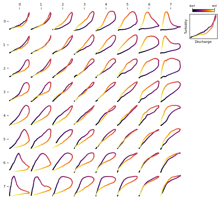
axs = plot_map(prototypes)
By default, plot_map uses a alphanumeric coordinate system for the prototypes with upper case letters for the rows and numbers for the columns. You can also get matrix-style coordinates by setting the coordinates_style argument to matrix.
A matrix-style coordinate system is consistent with the function get_BMU which returns the BMU coordinates using matrix coordinates (see more details)
axs = plot_map(prototypes, coordinates_style="matrix")
Visualize frequency distributions#
Get some data#
# loops = get_sample_data()[:81]

loops, _ = get_labeled_loops()
loops = loops[:81] # extract the first 81 loops
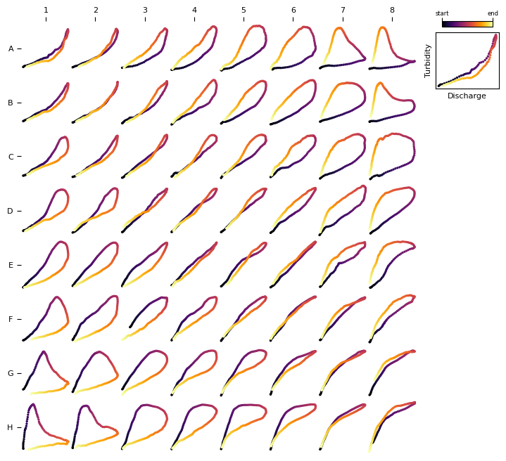
First, let’s visualize the data. We can leverage the plot_som function to visualize this dataset as all it requires is two dimensional array of loops. However, data is currently a one-dimensional vector of 81 loops. Let’s make it a 2D array of \(9\times9\) and plot it using plot_som, we’ll also change the colormap used to represent the time direction in the loop:
loops2d = loops.reshape(9,9,100,2)
axs = plot_map(loops2d, loop_cmap='viridis')
This dataset is comprised mainly of single-line and clockwise loops.
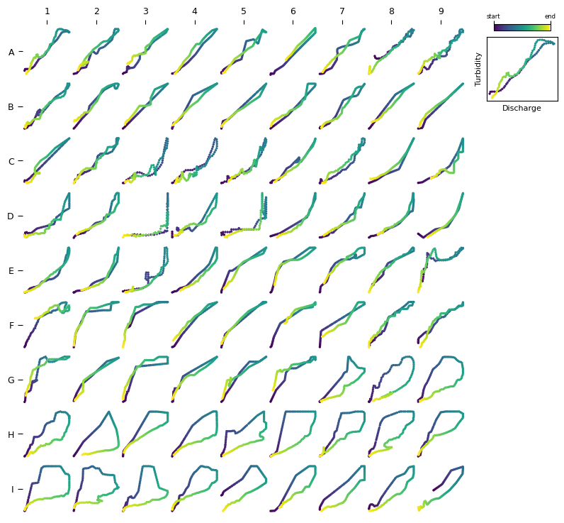
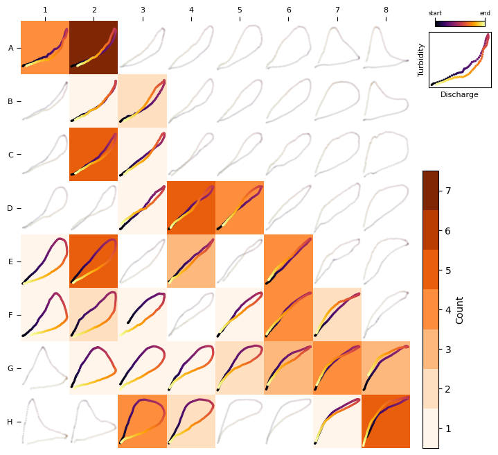
To visualize the frequency distribution using the General T-Q SOM (or any trained SOM), we can use the heatmap_frequency function from the hysom.utils.plots module.
heatmap_frequency requires a trained HSOM and a 1D vector of data samples (so we’ll use data instead of data2d)
heatmap_frequency(TQsom, loops)
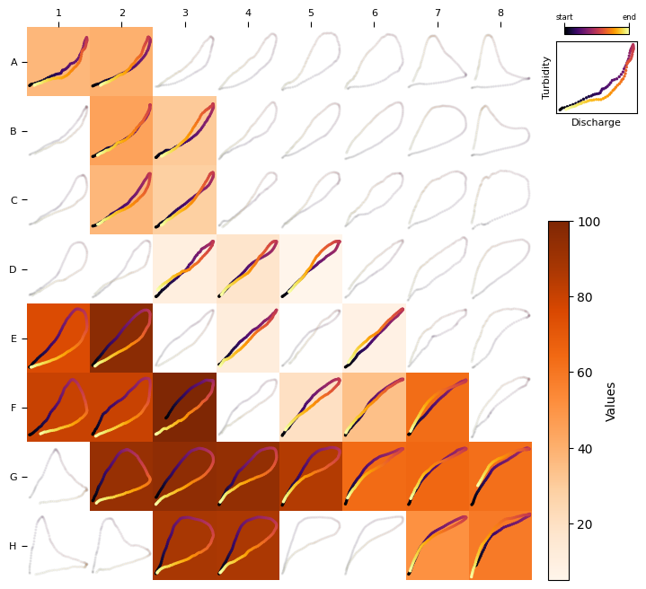
Heat maps for any variable#
A heat map can be generated to visualize the distribution of any variable across loop types, helping to identify associations between loop types and hydrologic factors.
For example, consider the question: Which loop types are associated with higher sediment load? To answer this, we need a dataset that provides sediment load values for each loop sample in our dataset and then plot the distribution of values over the SOM.
To illustrate this concept, we’ll create a synthetic dataset.
synthetic_load = np.linspace(0, 100, len(loops))
synthetic_load
array([  0.  ,   1.25,   2.5 ,   3.75,   5.  ,   6.25,   7.5 ,   8.75,
        10.  ,  11.25,  12.5 ,  13.75,  15.  ,  16.25,  17.5 ,  18.75,
        20.  ,  21.25,  22.5 ,  23.75,  25.  ,  26.25,  27.5 ,  28.75,
        30.  ,  31.25,  32.5 ,  33.75,  35.  ,  36.25,  37.5 ,  38.75,
        40.  ,  41.25,  42.5 ,  43.75,  45.  ,  46.25,  47.5 ,  48.75,
        50.  ,  51.25,  52.5 ,  53.75,  55.  ,  56.25,  57.5 ,  58.75,
        60.  ,  61.25,  62.5 ,  63.75,  65.  ,  66.25,  67.5 ,  68.75,
        70.  ,  71.25,  72.5 ,  73.75,  75.  ,  76.25,  77.5 ,  78.75,
        80.  ,  81.25,  82.5 ,  83.75,  85.  ,  86.25,  87.5 ,  88.75,
        90.  ,  91.25,  92.5 ,  93.75,  95.  ,  96.25,  97.5 ,  98.75,
       100.  ])
Now, we can use the heat_map function to see the distribution of values across loop types.
heat_map requires a trained HSOM, a 1D vector of loops (data) and a 1D vector of corresponding values synthetic_load
Note how, in the heat map below, clockwise loops are associated with higher color intensities. This pattern aligns with our synthetic_load, where values progressively increase, linking higher values to loops appearing toward the end of our dataset.
heat_map(TQsom, loops, synthetic_load)